Interactive visualizations using D3.js and D3 wrappers in Shiny
I think D3.js is the one of the best libraries out there for interactive visualizations. This post will cover two cases; the first one uses D3.js while the second one uses D3 wrappers in Shiny.
Domestic Flights by City in the US
The interactive plot is located here – Chord Diagram.
The mouseover interactions can only be seen at the link above. The following screenshots only show some examples of static content and do not do justice to the actual figure.
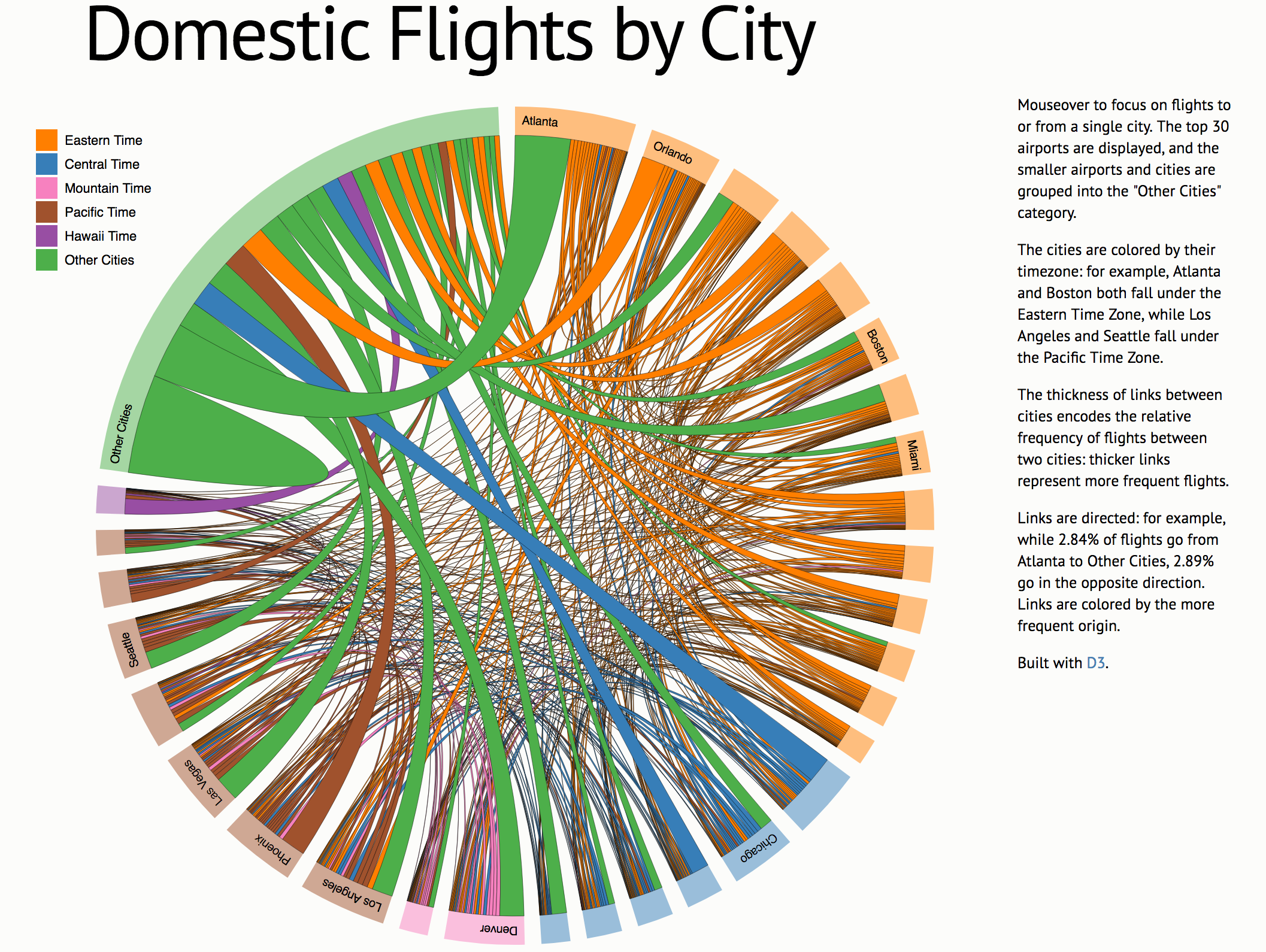
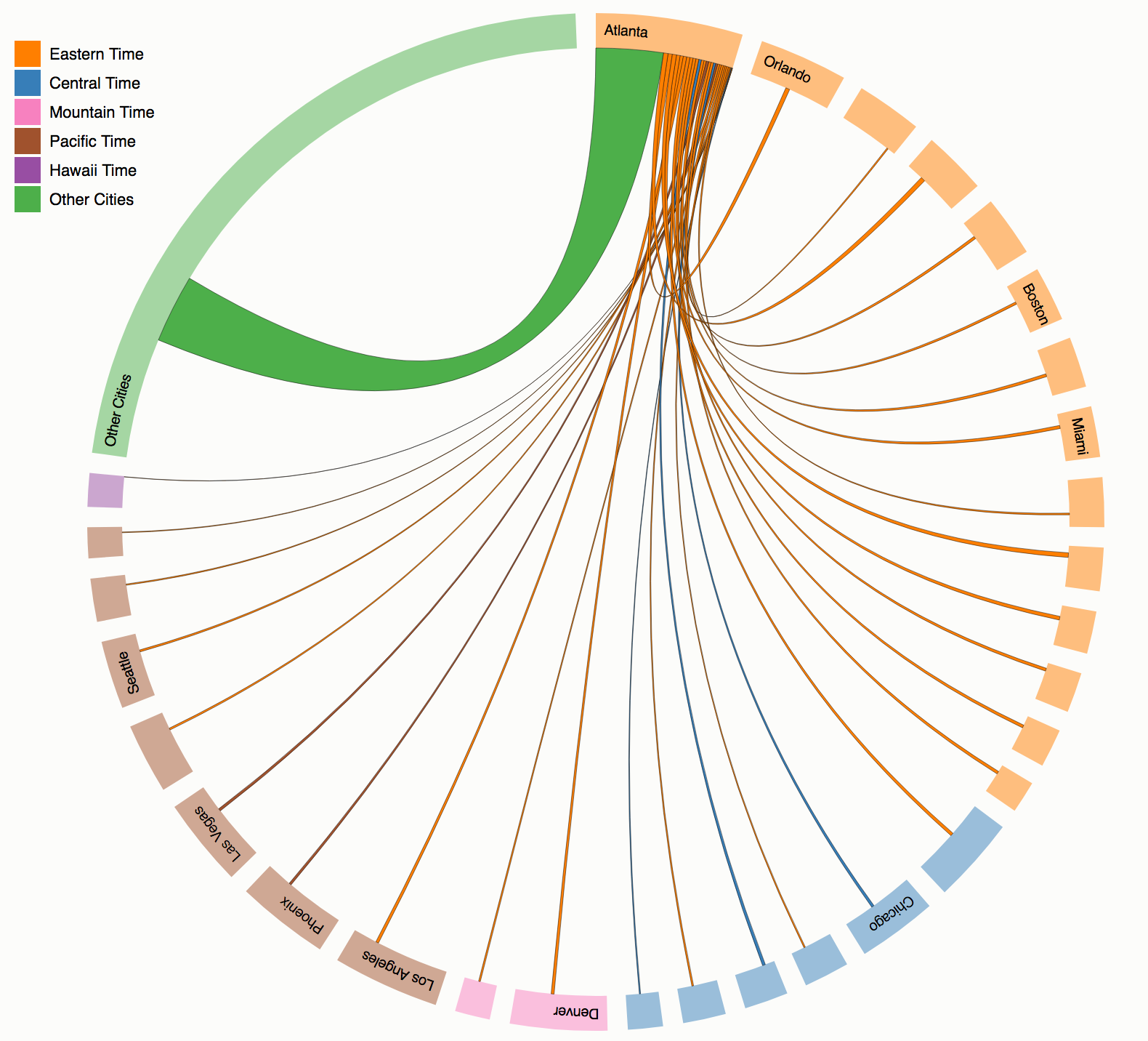
The code for the chord diagram and the flights data can be found here.
Diabetes visualizations in Shiny using D3 wrappers
Three different visualizations on a diabetes data set are located here – Diabetes Visualizations
Again, to explore the full interactivity of these plots, I recommend that you visit the above link. The following examples are screenshots of static content.
Parallel Co-ordinates Plot with Brushing
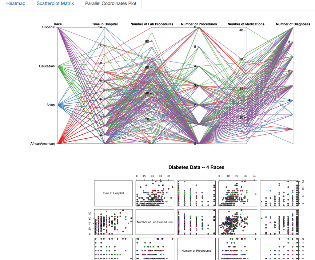
Here, you can select certain ranges of variables using brushing:
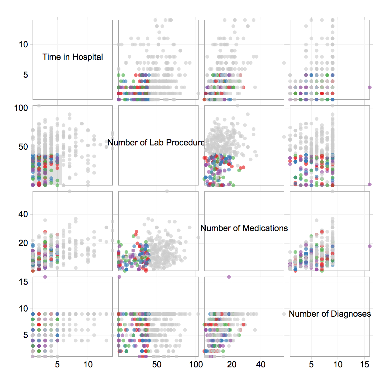
Scatterplot Matrix colored by different factors
Here, there are three different factor variables that can be used to color the points – race, gender, and age.
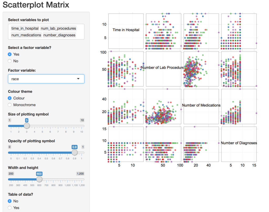
You can select certain points in one square using brushing, and the same points are selected in the other squares:
Heatmaps with different groupings
For these heatmaps, a user can select groupings to visualize measures such as the time in the hospital, and the number of lab procedures performed on diabetes patients.
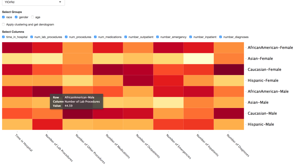
The user can mouse over a particular cell to see the average value for that particular column or measure across the row or grouping.
The code for all of the diabetes data visualizations can be found here.